How to Turn Complex Data into a Clear Figure
Scientific papers contain information that can be difficult for general readers or researchers from outside of your field to understand. On top of that, readers must navigate through lots of different sources to find the information they need. That’s why using turning data into figures that are easy to understand and highly memorable can help your paper stand out from others.
In this article, we show authors the importance of visuals in research and the steps involved in turning complex data into a strong, clear visual message.
The importance of visuals in research
In today’s digitised world, we are expected to absorb a lot of information on a daily basis. Indeed, the average person processes as much as 74 GB of inormation a day. Visuals can significantly improve absoprtion and retention, making information more interesting and impactful.
The importance of graphical abstracts in the communication of research has been acknowledged. Graphical abstracts can summarise the findings of an entire study by turning this information into a single, clear visual. This transformation facilitates the speed of information absorption, reducing the time spent on research.
It has also been shown that figures have an impact on research engagement. Clear and effective visuals can lead to increased citations and more accurate and impactful references.
Turning your data into a figure
There are a few steps to consider when turning your data into a figure. The main considerations are listed below.
Defining the message for readers
Authors create figures to communicate something to readers. This means that any visual needs to have a message that readers can take from it.
Imagine that the message of your figure is telling a story. Visually guide the reader from your initial hypothesis to any conclusionary findings. Make sure that the visual narrative makes sense, as well as being simple and effective for the specific audience you have in mind.
Refining your data
The second step in turning your data into a figure involves refining your data. Collecting relevant data that supports your message, filtering out any unnecessary information to avoid overloading the reader or confusing the messaging, whilst also ensuring you retain the full context of the data to ensure integrity best practices.
Instead of focusing on individual data points, prioritise the information that best supports the story you want your visual to tell. Leave out any information that’s not relevant to the overall context of the data and your message. Use averages, sums, or highest/lowest number categories to create impactful messaging and highlight patterns in the data.
Choosing the right figure
What type of figure you use will depend on two things: the kind of data you have, and the trends or relationships between variables that you want to highlight.
Here are some examples of figure types and their uses:
- Bar graphs: Best for category comparison.
- Line graphs: Ideal for highlighting trends over time.
- Scatter plots: Useful for identifying relationships between variables.
- Pie charts: Best for showing percentages or proportions of a whole.
It is important that your figure is not just the right type for the purpose of your message. It also needs to be formatted correctly. Ensure that the images used are high-resolution and that any journal-specific guidelines for figures have been followed.
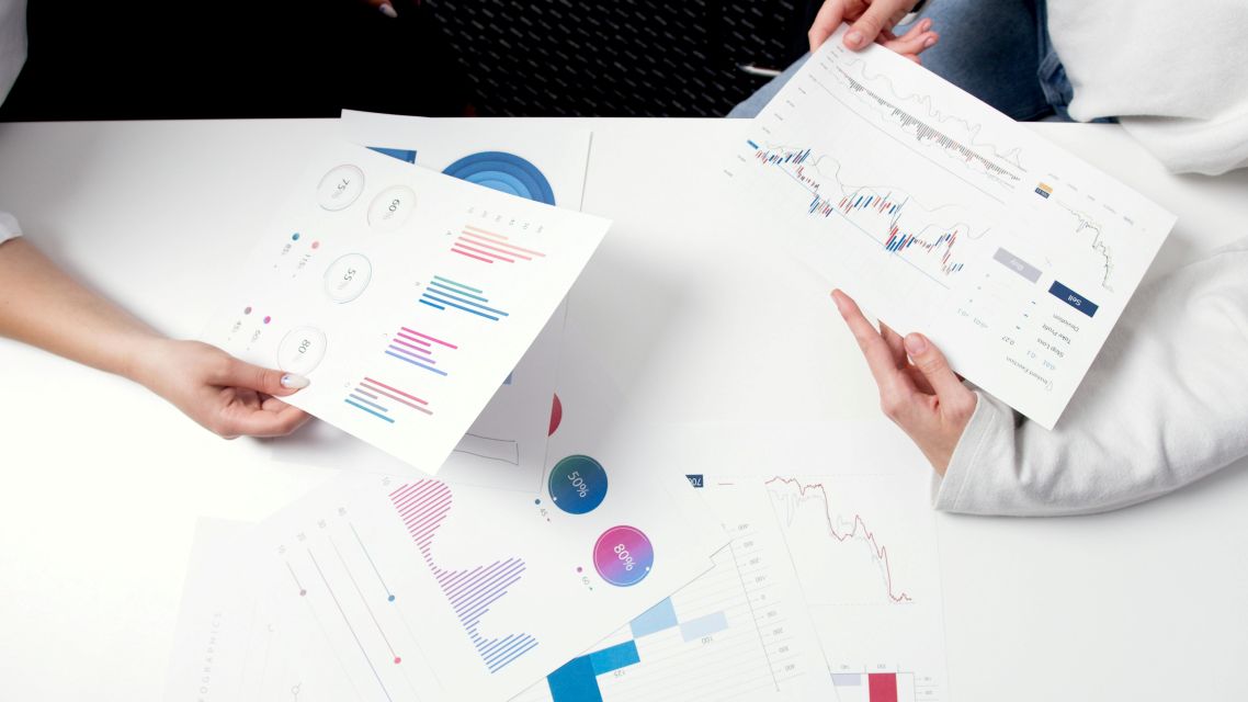
Getting help with figure editing
Are you a researcher who needs help turning your data into a figure?
![]()
Author Services produce publication-ready figures and tables that clearly communicate your research to readers. The Figure and Table editing service includes the enhancement of charts and graphs by revising colours, shading, size, resolution, borders, font, and file type. This is all completed in one business day after payment. Click here for a free quote.
Subscribe to the Author Services Newsletter for tips, discounts, and updates.